Table of Contents
Table of Contents
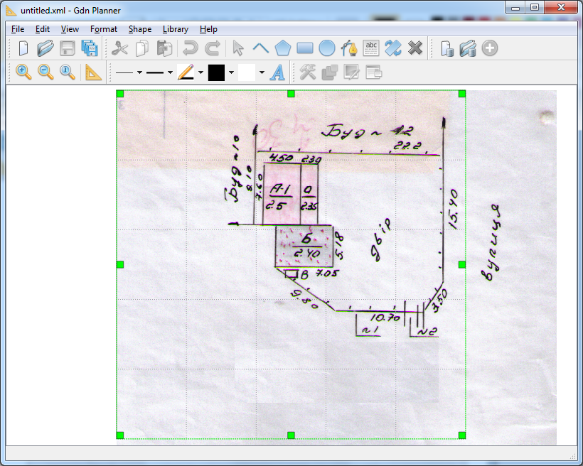
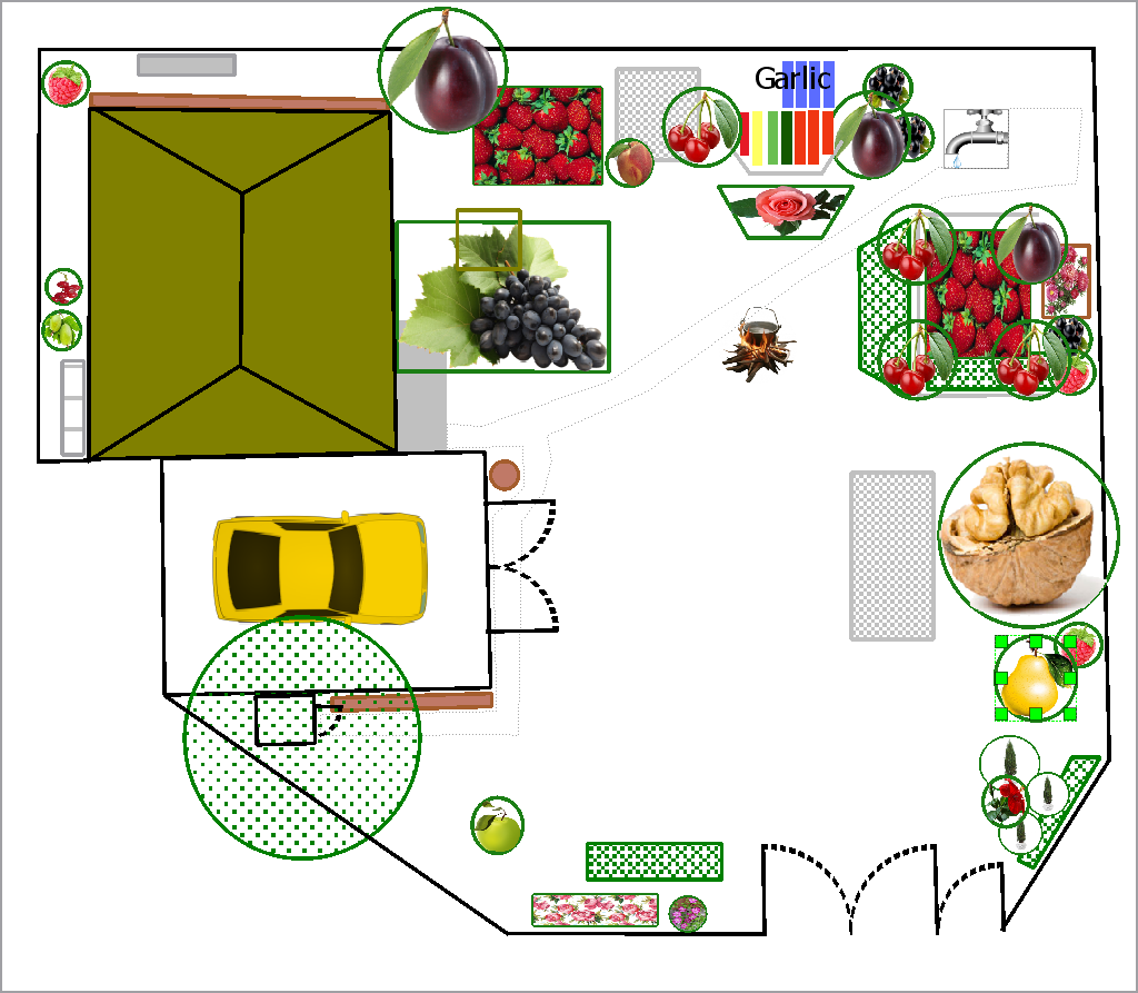
GdnPlanner may be used to create simple 2D plans of your garden or flat (see image Garden example).
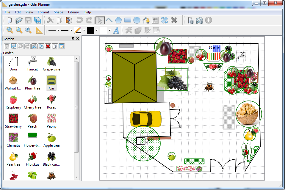
It provides the library with basic shapes for garden (on the left in the image) and main drawing area. Library may be extended with shapes created by the user, and new libraries may be created.
For each shape user may specify any number of custom properties (see image Properties).
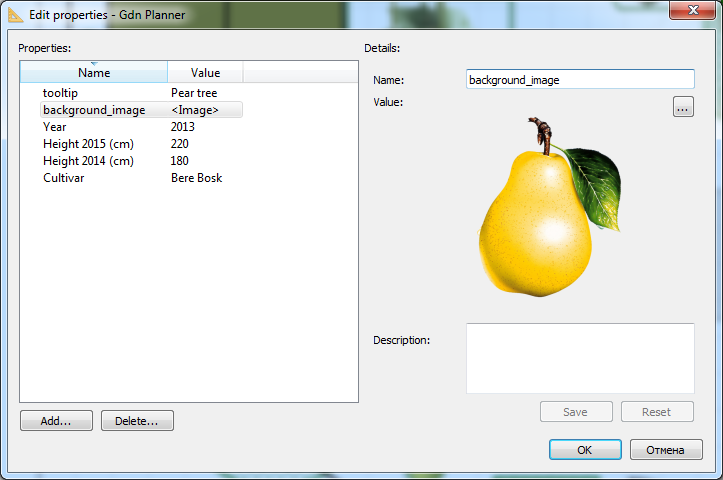
Table of Contents
Select item from
menu to create new project. Also
Ctrl+N key combination or  toolbar button may be used to create new project.
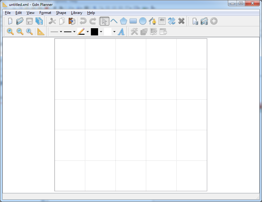
New project window is shown in image New project.
toolbar button may be used to create new project.
New project window is shown in image New project.
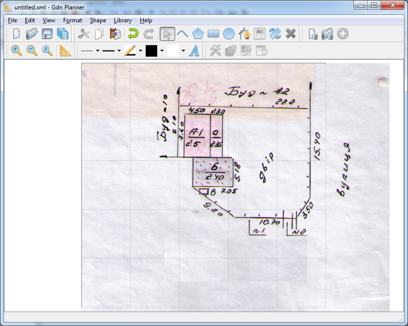
Frequently user has some 'official' documents for the garden, and the document may contain the plan. In that case it is helpful to scan the plan page and use it as a background to draw plan. Select item from menu to add background image, then choose the graphics file in the Background file selection dialog. See example in the image Background image.
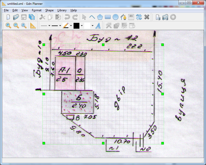
In many cases background image does not fit the plan area. So, the plan should be resized.
Select item from menu to adjust plan size. Markers on the screen will indicate current plan size (see image Resize plan).
Use mouse to drag the markers and adjust plan size. Repeat steps if necessary. Final state is shown in image Resized plan.
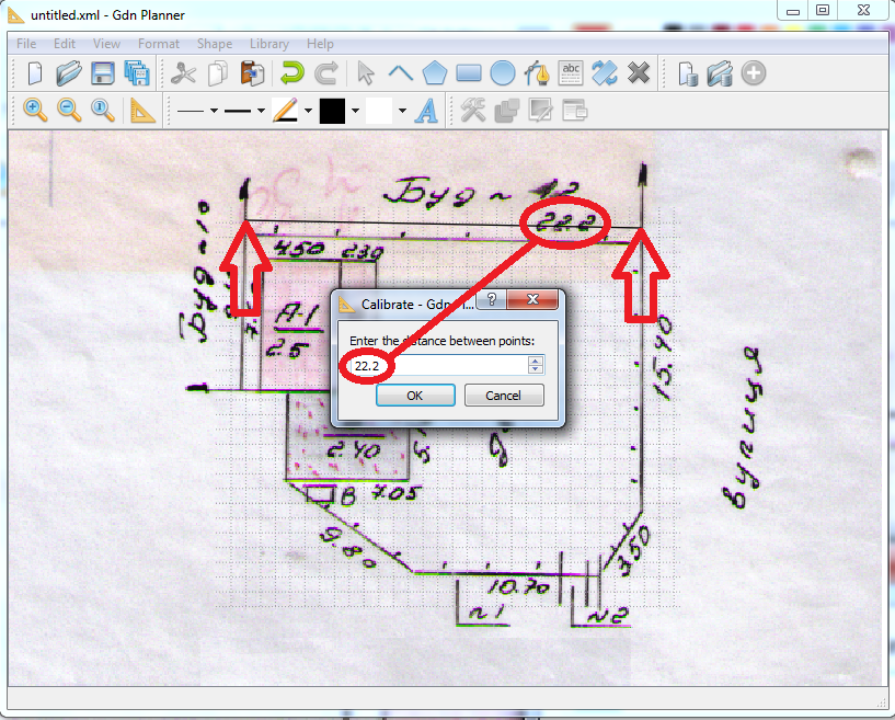
Now it is time to set the scale of our plan. Select item from menu. Draw line using mouse between two points with known distance between them (red arrows in the image Calibrate). Release mouse button, enter distance (in meters) in the displayed Calibrate dialog and press OK. In our case the distance is known from the background image (see red circles in image Calibrate).
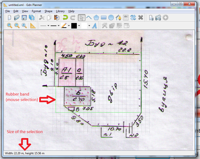
Now all distances will be displayed in accordance to the scale set during the calibration. Distance usually is displayed in status bar at the bottom of the application window. For example, try to select some area on the screen with mouse to see the distance (see image Distance display).
Now it is a good time to save the project. Select
item from menu
and enter the file name. By default project files use extension
gdn.
Select item from
menu to draw polyline (open polygon). Also
 toolbar button may be used to draw polyline. Each
click with left mouse button adds a vertex. Do not keep mouse button
pressed while drawing the line. Use right mouse button click to finish.
Use Esc key to cancel line drawing. Incorrect position
of some vertex can be fixed in future (see below). Line width, color and
pattern may be selected from menu or from
toolbar. Let's draw two lines over garden borders as shown in image
Borders (borders are not drawn on walls an on
gates).
toolbar button may be used to draw polyline. Each
click with left mouse button adds a vertex. Do not keep mouse button
pressed while drawing the line. Use right mouse button click to finish.
Use Esc key to cancel line drawing. Incorrect position
of some vertex can be fixed in future (see below). Line width, color and
pattern may be selected from menu or from
toolbar. Let's draw two lines over garden borders as shown in image
Borders (borders are not drawn on walls an on
gates).
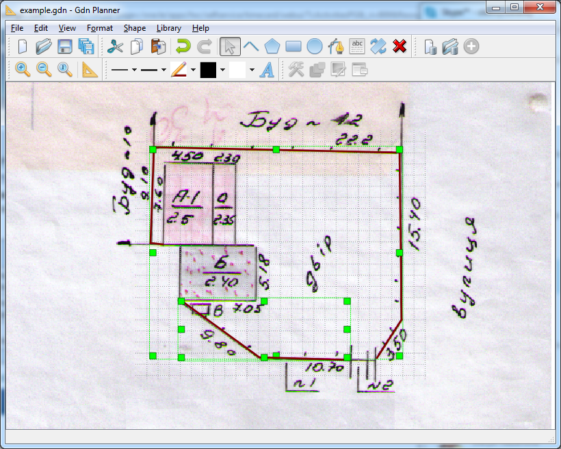
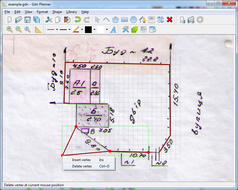
To adjust vertex position select the line shape and click with left mouse button on the selected line. Application will switch to vertex editing mode (see image Vertex edit mode). In this mode it is possible to:
move each vertex - just drag it with mouse;
add new vertex - use right mouse button to call context menu, then select item. Or just press Insert key;
delete vertex - put mouse over the vertex, call for context menu and select item. Or just press Ctrl+D keys.
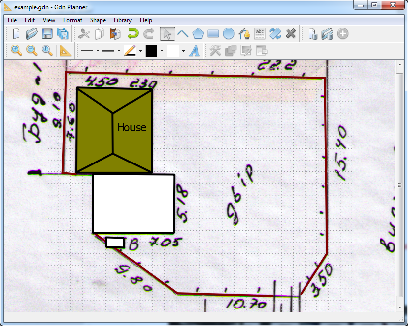
Next step is to add shapes for house, garage and WC - all of them are shown on the plan background image. The house shape will be created using polygon (closed polyline, last vertex is connected with the first vertex). Such closed shape may be filled. Fill color and fill pattern may be selected from menu or from toolbar. Vertexes are added to polygon in the same way as to the line, and vertex editing is possible in the same manner.
Select item from
menu to draw polygon. Also  toolbar button may be used to draw polygon. After
drawing the polygon around the house the fill color was selected from
menu. Also roof is added as some lines. Garage
and WC are also drawn like a filled polygon.
toolbar button may be used to draw polygon. After
drawing the polygon around the house the fill color was selected from
menu. Also roof is added as some lines. Garage
and WC are also drawn like a filled polygon.
After that the text House was placed over the
house shape. Select from
menu to add text. Also  toolbar button may be used to add text. After
that click with left mouse button at the point where the text should be
displayed. Enter the text in the Add text dialog
and press OK. Text font may be set via
menu or toolbar button.
toolbar button may be used to add text. After
that click with left mouse button at the point where the text should be
displayed. Enter the text in the Add text dialog
and press OK. Text font may be set via
menu or toolbar button.
The result is shown in image Polygon and Text.
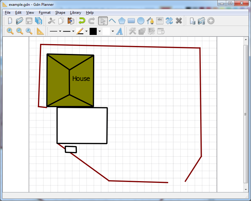
At this stage all data from the background image are used, and it may be removed. Select background from menu. Result is shown in image No background.
Other shapes may be added to project:
Rectangle. Select item from menu to draw rectangle. Also
 toolbar button may be used to draw
rectangle. Click left mouse button at the top left corner of
rectangle and drag mouse till the bottom right corner of the
rectangle. Release mouse button. New rectangle shape will be
added. If Ctrl is pressed during mouse drag then
square will be added. Rectangle vertexes may be edited in the same
way as polygon and polyline - after such editing rectangle may be
transformed to polygon;
toolbar button may be used to draw
rectangle. Click left mouse button at the top left corner of
rectangle and drag mouse till the bottom right corner of the
rectangle. Release mouse button. New rectangle shape will be
added. If Ctrl is pressed during mouse drag then
square will be added. Rectangle vertexes may be edited in the same
way as polygon and polyline - after such editing rectangle may be
transformed to polygon;Ellipse. Select item from menu to draw ellipse. Also
 toolbar button may be used to draw ellipse.
Ellipse is specified using bounding rectangle. Click left mouse
button at the top left corner of bounding rectangle and drag mouse
till the bottom right corner of the rectangle. Release mouse
button. New ellipse shape will be added. If Ctrl
is pressed during mouse drag then circle will be added;
toolbar button may be used to draw ellipse.
Ellipse is specified using bounding rectangle. Click left mouse
button at the top left corner of bounding rectangle and drag mouse
till the bottom right corner of the rectangle. Release mouse
button. New ellipse shape will be added. If Ctrl
is pressed during mouse drag then circle will be added;Arc. Select item from menu to draw arc. Also
 toolbar button may be used to draw arc. Arc
is specified using bounding rectangle. Click left mouse button at
the top left corner of bounding rectangle and drag mouse till the
bottom right corner of the rectangle. Release mouse button. New
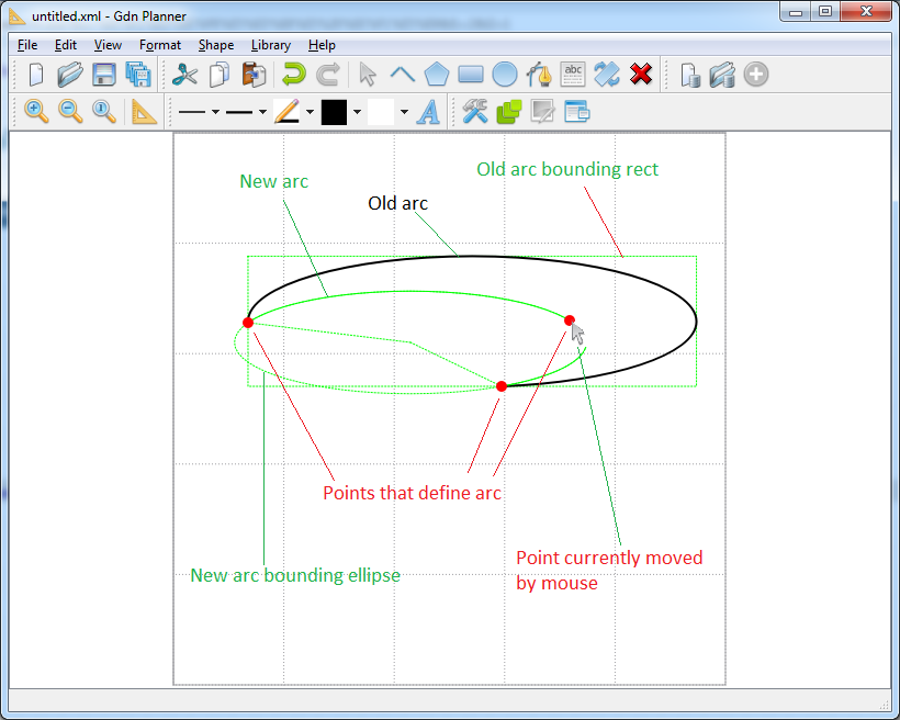
arc shape will be added. Arc is a part of ellipse, it is defined
by 3 points and axial ratio of ellipse. Axial ratio may be changed
by resize of arc, 3 points may be re-located in the editing mode
similar to polygon vertex editing - see image Arc.
toolbar button may be used to draw arc. Arc
is specified using bounding rectangle. Click left mouse button at
the top left corner of bounding rectangle and drag mouse till the
bottom right corner of the rectangle. Release mouse button. New
arc shape will be added. Arc is a part of ellipse, it is defined
by 3 points and axial ratio of ellipse. Axial ratio may be changed
by resize of arc, 3 points may be re-located in the editing mode
similar to polygon vertex editing - see image Arc.
Shape may be selected. Selected shape is indicated by green dotted rectangle and markers (see image Borders). Some markers may be not shown if resize is not supported in that direction. Normally shape is selected by mouse click. Hold the Ctrl key pressed while clicking the mouse to select more than one shape. Also shapes may be selected by rubber band. Press and hold left mouse button and move the mouse - rubber band will be displayed on the screen (see image Distance display). On mouse button release the shapes inside the rubber band will be selected. Choose item from menu or use key combination Ctrl+A to select all shapes on the screen.
Shape geometry may be edited in the following way:
Move. Choose item from menu or use
 toolbar button. Select shape(s), click left
mouse button on one of them and drug. Selected shape(s) will be
moved.
toolbar button. Select shape(s), click left
mouse button on one of them and drug. Selected shape(s) will be
moved.Resize. Choose item from menu or use
toolbar button. Select shape, click left
mouse button on one of the markers around the shape and drug the
marker. Selected shape will be resized. Hold Ctrl key to keep
ratio on corner markers.Rotate. Select item from menu or use
 toolbar button. Select shape. Markers
change the color, cursor over marker change the shape to
. Click left mouse button on one of the
markers around the shape and drug the marker. Shape will be
rotated.
toolbar button. Select shape. Markers
change the color, cursor over marker change the shape to
. Click left mouse button on one of the
markers around the shape and drug the marker. Shape will be
rotated.Edit vertex. Polyline, polygon vertexes (see image Vertex edit mode) and arc control points (see image Arc) may be edited after the second click on the selected shape.
Selected shapes may be grouped. Select item from menu or use
 toolbar button to group shapes. Key
combination Ctrl+G also works.
toolbar button to group shapes. Key
combination Ctrl+G also works.Selected group may be un-grouped. Select item from menu or use
 toolbar button to ungroup shapes. Key
combination Ctrl+U also works. Polyline (not
polygon!) may be split into pieces also with ungroup command -
select polyline to split and call ungroup command.
toolbar button to ungroup shapes. Key
combination Ctrl+U also works. Polyline (not
polygon!) may be split into pieces also with ungroup command -
select polyline to split and call ungroup command.Shapes can overlap. Select item from menu or use key combination Alt+<Right arrow>to display selected shape(s) over other shapes. Select item from menu or use key combination Alt+<Left arrow>to display selected shape(s) under other shapes.
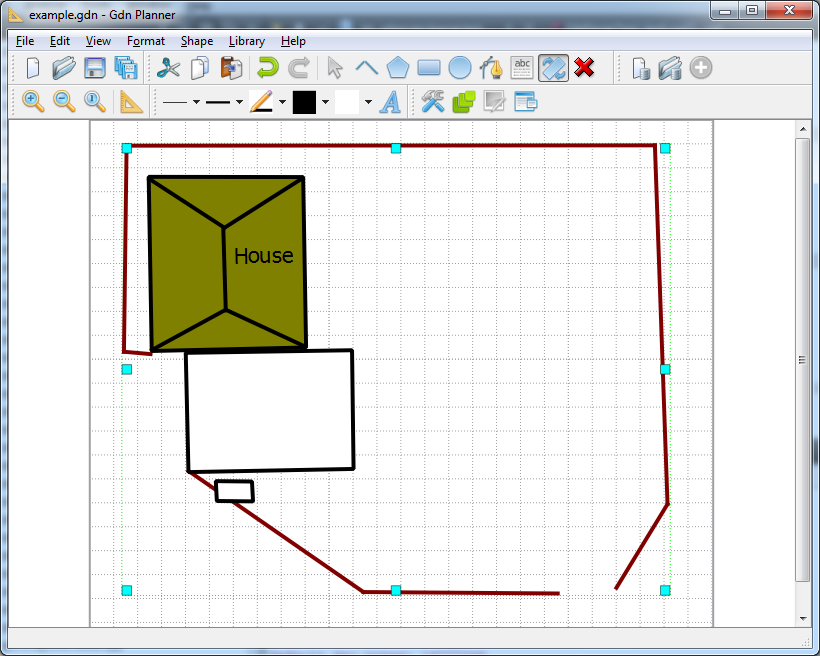
Let's perform some actions on our example project:
group all shapes related to house (select with rubber band and press Ctrl+G);
group all shapes on the screen into one group (press Ctrl+A to select all, press Ctrl+G to group);
rotate the group until top border is oriented horizontally (use rotate mode).
The result is shown in image Rotated plan.
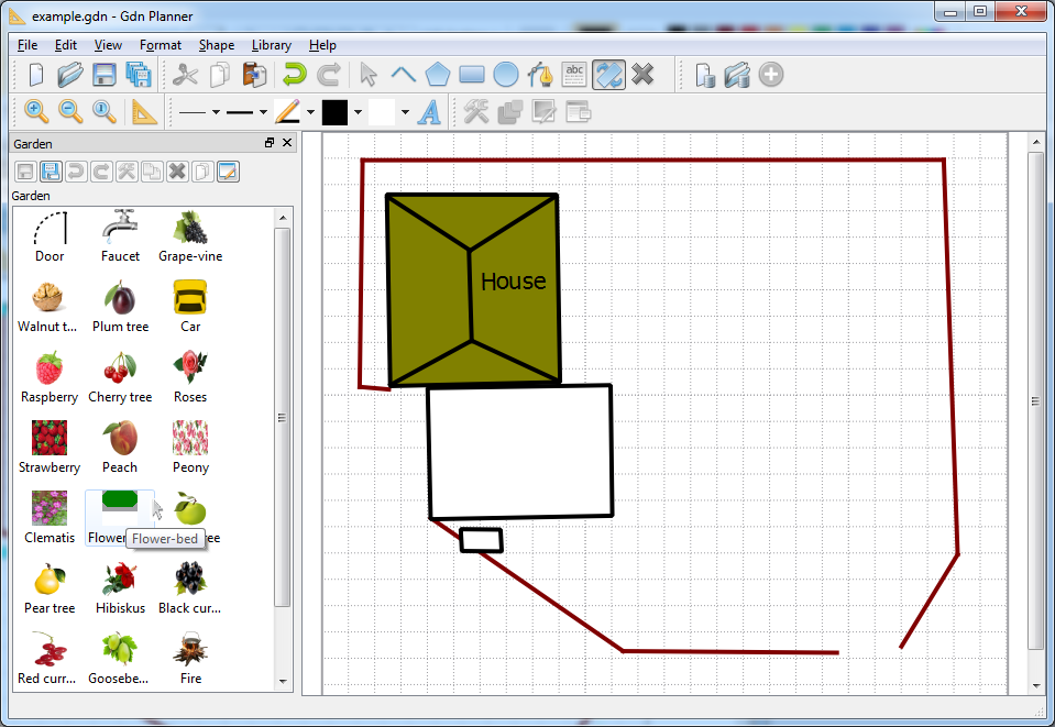
Application supports libraries of predefined shapes. Default
library file extension is gdnlib. Library with
basic shapes for garden is located in examples
directory. examples directory on Windows is
available in the application installation directory.
examples directory on Linux is available in
/usr/share/gdnplanner directory.
Select item from
menu or use  toolbar button to open the library. Go to the
examples directory in displayed Open
Library file dialog and select
garden.gdnlib file. Press OK.
Library will be displayed (see image Garden library).
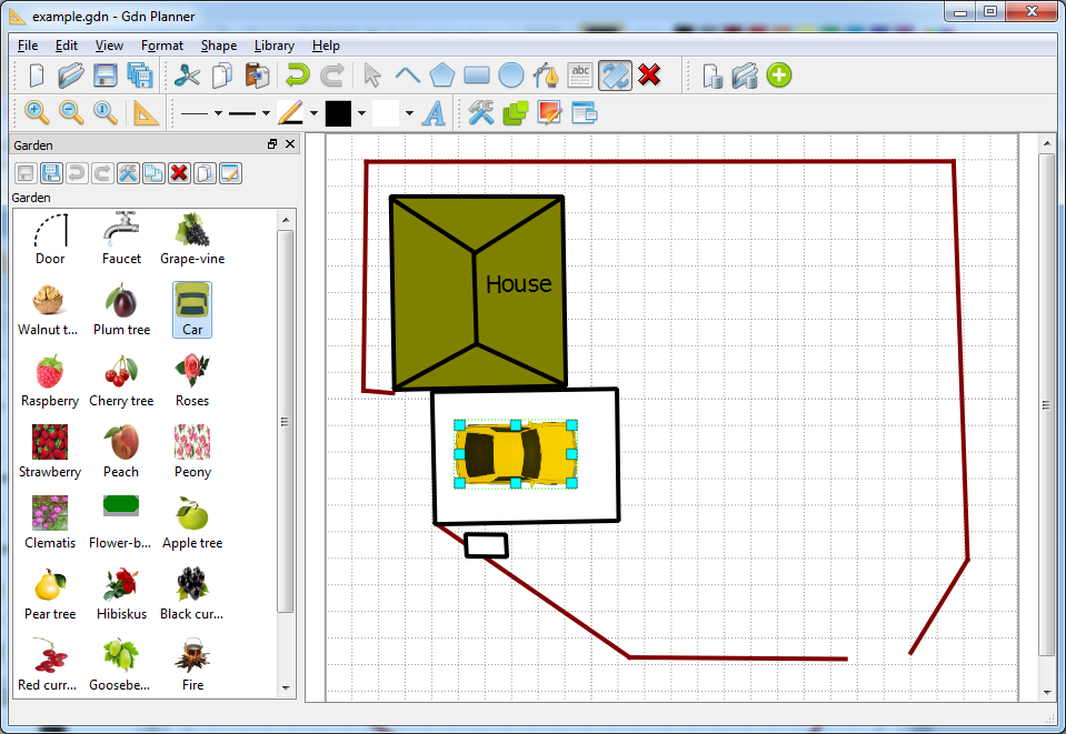
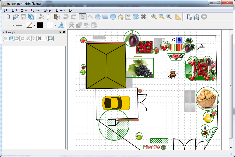
Select a Car item in the library and drag-n-drop it to garage. Select newly added Car shape and rotate it to fit in garage, as shown on image Car in garage.
In the same way other items from library may be added to the plan to get very close to the garden plan shown on image Garden example.
Library editing and adding new items to the library is described in Libraries section.
The following tools are available for shape formatting in menu (see image Format tools):
Line width
Line pattern
Line color
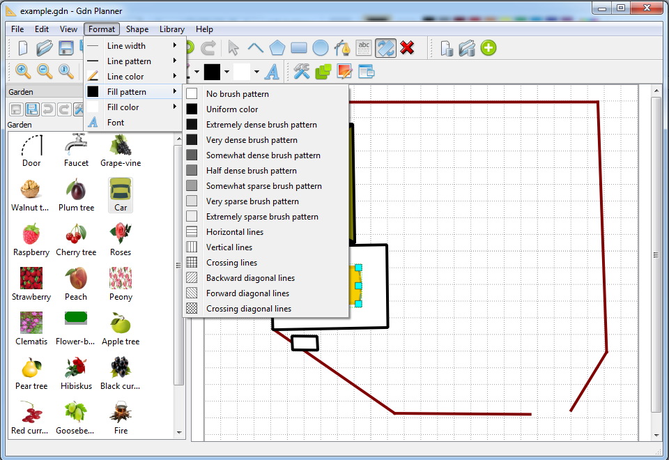
Fill pattern
Fill color
Font
Also the tools may be used via Format toolbar. Current value of the tool is used for all new shapes. Select shapes and apply new tool value to set it to the selection. Value is updated for all children shapes if shape is a group.
Another useful tool
 is available in menu and
in Shape toolbar. It sets the format tool values to
the values of the selected shape.
is available in menu and
in Shape toolbar. It sets the format tool values to
the values of the selected shape.
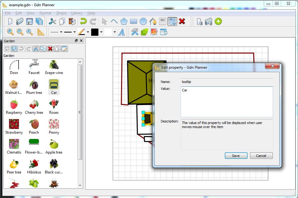
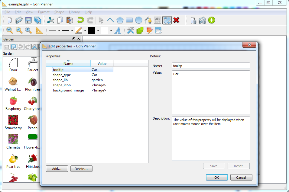
Each shape may have tooltip. Select shape and call
from
menu or use  toolbar button. Edit
property dialog will be displayed - tooltip is one of the
shape properties, see Add custom properties. Call the dialog
for Car shape as shown in image Tooltip. Enter tooltip text and press
Save.
toolbar button. Edit
property dialog will be displayed - tooltip is one of the
shape properties, see Add custom properties. Call the dialog
for Car shape as shown in image Tooltip. Enter tooltip text and press
Save.
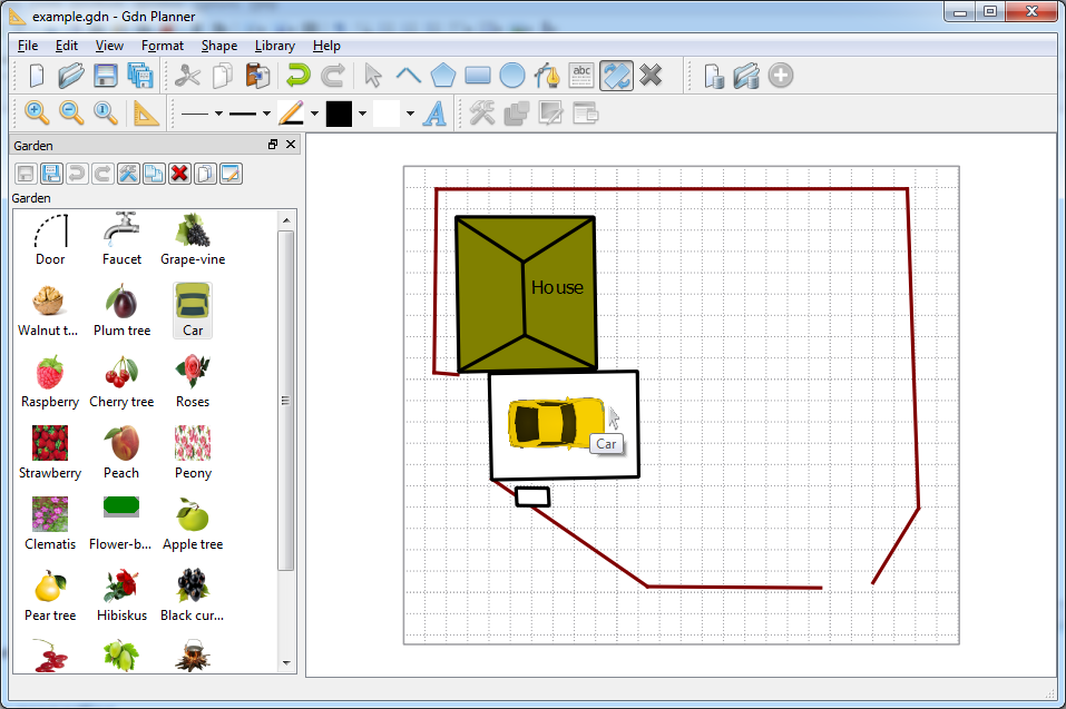
Tooltip will be displayed when user moves mouse over the item (see image Car tooltip).
Shapes that may be filled (polygon, rectangle, ellipse, circle) support background image. This property is widely used in Garden library - almost all library items have background image.
Select shape and call from menu or use
 toolbar button. Edit
property dialog will be displayed - background image is one
of the shape properties, see Add custom properties. Call the
dialog for Car shape as shown in image Car background image.
toolbar button. Edit
property dialog will be displayed - background image is one
of the shape properties, see Add custom properties. Call the
dialog for Car shape as shown in image Car background image.
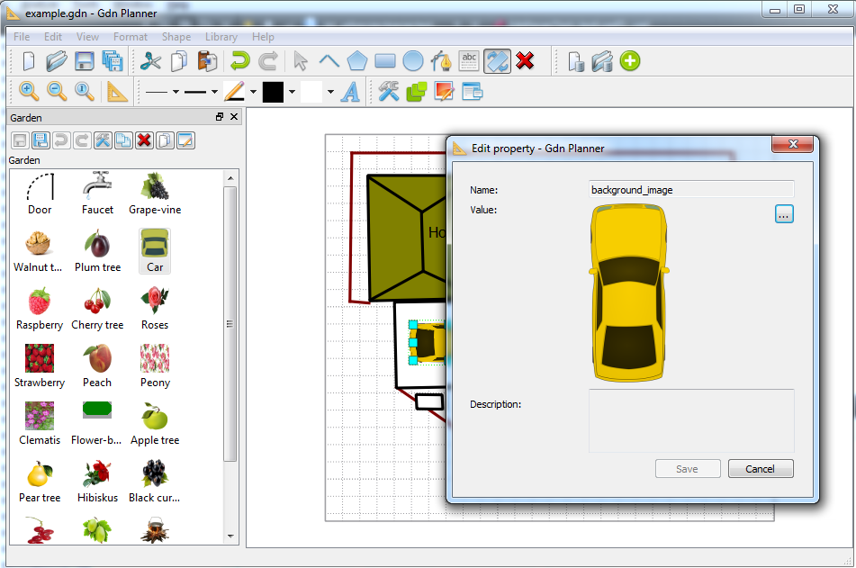
Use ... button to select different image file for the background image. All images are stored in project file. So, if big image is selected then it is scaled to 200x200 size (keeping aspect ratio) and used as a background image.
Tooltip and background image are just custom properties with predefined names. User may define other custom properties as described in Add custom properties.
For each shape user may specify any number of custom properties. Custom property consists of:
name - string to identify the property. Property names may duplicate. Property name should not be empty. In case if value has measurement units it is useful to add the unit name to this property, for example "Height (cm)";
type - string ("string property example"), integer (42, -1), decimal (3.14, -1.23e-1), date & time (2016-01-01 00:00:01), logical (yes, no) and image. Image size is automatically reduced to 200x200 keeping aspect ratio;
value - property value of the specified type;
description - optional string to clarify property meaning.
Some custom property names have special meaning for the application:
tooltip (string) - shows shape tooltip, see Add tooltips and background images;
background_image (image) - shows shape background image (if supported for this type of shapes), see Add tooltips and background images;
shape_type (string) - item name in library. All shapes added to project from the library will have the same value of this property as item in the library. Generated automatically for each item in the library, but may be changed by the user;
shape_lib (string) - library name. Just for reference where the shape may be found. Generated automatically for each item in the library. No reason to change by the user;
shape_icon (image) - icon of the item in the library. Generated automatically for each item in the library, but may be changed by the user;
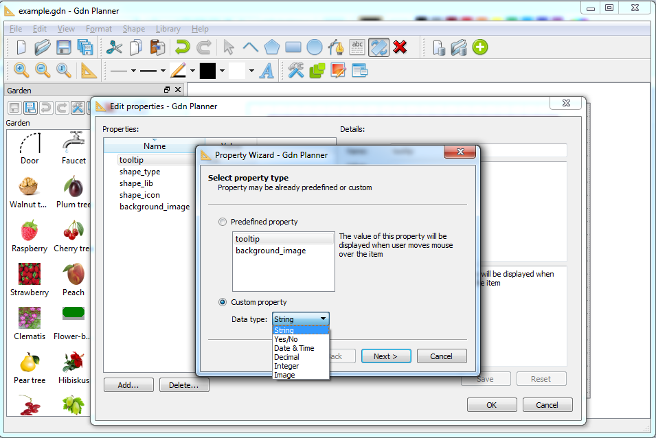
Let's add Year of manufacture property to our Car shape. Do the following to add the custom property to the shape:
select shape;
select item from menu or use
 toolbar button. Edit
properties dialog will be displayed (see image Custom properties dialog);
toolbar button. Edit
properties dialog will be displayed (see image Custom properties dialog);Click Add... button. Property Wizard dialog will be displayed (see image Property Wizard). Predefined property section allows to add tooltip and background image. Selection of this option will navigate to correspondent dialogs from Add tooltips and background images. To add other property select Custom property and specify property type. Select Integer in our case. Click Next;
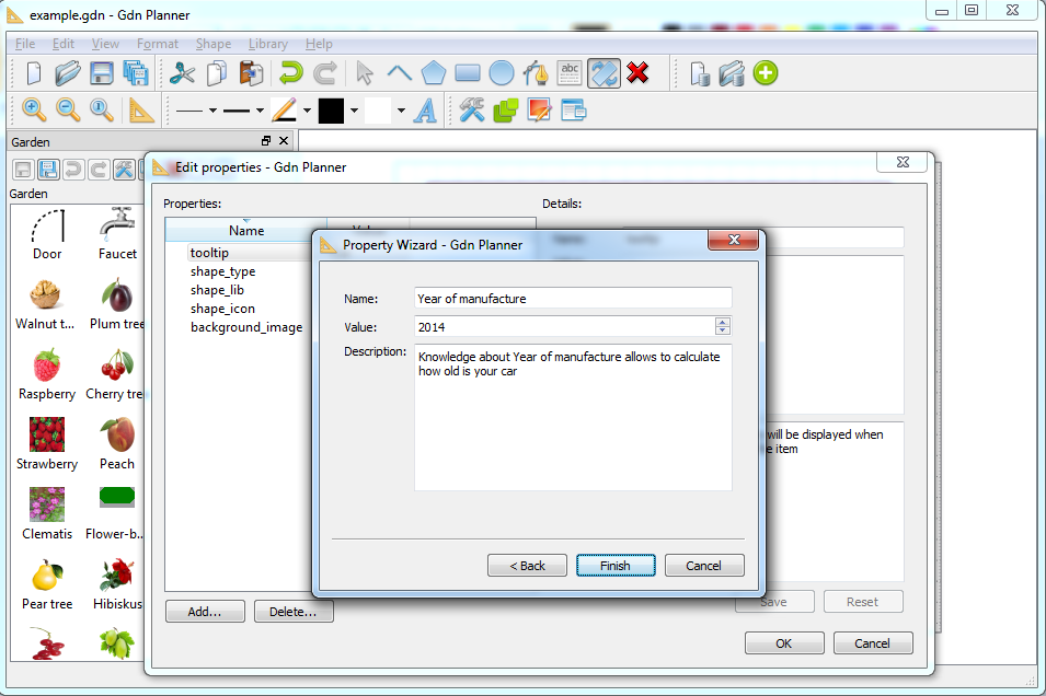
Next wizard page will be displayed (see image Integer property). Enter values and press Finish;
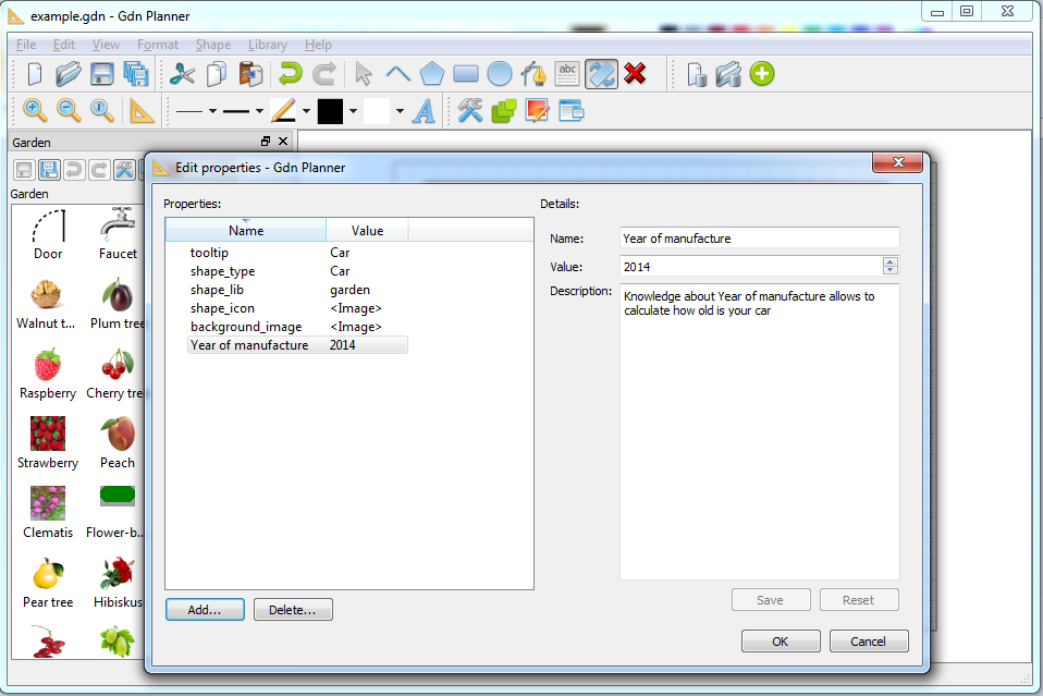
Edit properties dialog will be displayed with new property in the list (see image Edit new property). Selected property may be edited in Details: section of the dialog. Also selected property may be deleted using Delete... button;
Press OK to save changes into the shape.
Select item from
menu to save the project. By default project
files use extension gdn.
Select item from menu to save the project in different file.
It is possible to export project to image. Select item from menu and specify image file name in Save image dialog (see image Exported image).
Also it is possible to print project using item from menu.
Table of Contents
Select item from
menu to create new library or
press toolbar button. New library will be created as
shown in image New library.
toolbar button. New library will be created as
shown in image New library.
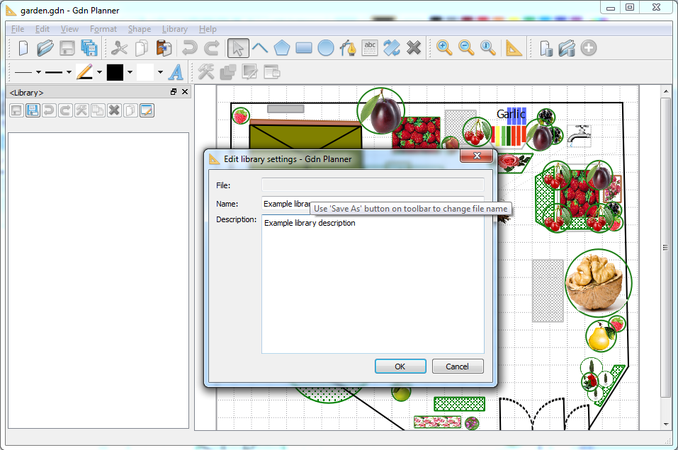
If you work with many libraries then it may be useful to specify
library name and description. Press Edit library
 button on library's toolbar. Edit
library settings dialog will be displayed (see image Library settings). Enter library name and description,
then press OK.
button on library's toolbar. Edit
library settings dialog will be displayed (see image Library settings). Enter library name and description,
then press OK.
Library name will be displayed in the dock window caption, but some combinations of OS/Window manager do not support this. Also library name is shown under the library toolbar, and description is shown as a tooltip for library name.
Do the following to add the shape to the library:
Select shape;
Select item from menu or press
 toolbar button in application
Library toolbar.
toolbar button in application
Library toolbar.Selected shape will be added as an item to the library. Item name and icon are generated automatically. Follow instructions in Edit item in library to modify them.
Shape custom properties are describer in Add custom properties. The same properties editor is available for
library items. Select the item in the library and press
toolbar button on the library toolbar above the
list of library items.
Select library item and press F2 to edit in-place the item text. You may also edit the value of shape_type property in the properties editor.
Select library item and call context menu (right mouse button click). Select item from context menu to edit item's icon in the library. You may also edit the value of shape_icon property in the properties editor.

